Tuesday, February 27, 2007

Here it is

OK, time for some totally irrelevant humor just to brighten your day. A good friend of mine sent me this joke in my email. I got a good chuckle out of them and I thought I'd share the love. I think these are supposed to be real college exam results:


The last one is pretty genious if you ask me.


This some pretty cool flute + beatboxing work. Funky. Makes me want to bust out my bass again and lay down the law.

Monday, February 26, 2007

Neverending Upgrades

A lot of programs coming out on the horizon. Start figuring out how you can afford it all if you're the type of person who likes using all the latest.

I'm waiting to see how this whole affair with Window's Vista is going to turn out. I haven't tried it yet, but if my experiences in the past watching Windows progress through 2 major overhauls goes, (Windows 3.1 and Windows XP), I'd wait between 6 months to a year before touching Vista. The only reason I can see you need to do so is if you have new programs that absolutely require you to upgrade. Until then, stick to XP.

That Aero thing that Vista does is neat, but it's just eye candy. I think if I wanted eye candy, I'd switch to OSX on Apple.

I've also been testing out the beta version of Photoshop CS3. It's not bad...the interface has been overhauled some, and like always, familiar tools are not always where they were before. My computer's about 3 years old now (ancient by computer standards) so I can tell CS3 noticably slower in performance. I think you'd need about 2 GBs of memory to run this sucker comfortably.

The most immediately noticable improvements to CS3 is that Adobe Bridge is much more improved, almost like they borrowed some of the ideas from Lightroom, and they now made "Smart Filters" instead of just "Smart Objects". So now you can put all kinds of filter effects on your photos without actually worrying about messing up the original.

Speaking of Lightroom, if you've downloaded and tried the trial version like I recommended...it will automatically expire in a couple more days. Right now I think they have a special that will last through the end of April where you can have $100 off the program.

Do you need it? I think if you're either a professional photographer, or if you're even a person that simply takes a lot of photos, you should get it. It's THAT good. Even if you're simply using it to organize and sort your photos, it might be worth getting.

Not only that, but it will help you with printing, developing, and even creating web galleries too. It's just a HUGE time saver for anything photo related. The newly released 1.0 version already has a number of improvements over the beta version, I spend my morning goofing around with it and watching some tutorials. At the risk of sounding like the total geek....I had fun. :)

It runs perfectly fine on my old machine as well.... wouldn't be terrible if it doesn't run on Vista? :)

Saturday, February 24, 2007

Vector Images

Hey are you bored with my tutorial tips yet? Hey, it's either deal with these tips or hear my grumble about my taxes again.... yeah, this would be better now wouldn't it?

Remember I promised you I'd show you the TWO ways that your computer looks at graphics? Last time I covered the pixels. So if you have a graphic of your logo or something and you tried to blow it up, you'd get something that looks like this:

Butt ugly isn't it? In fact, if you look at old school computers, the lettering and graphics looked even worse then this. Remember those Tandy's and Ataris? OK, I'm dating myself.

Now some bunch of geniuses sat around their computers somewhere along the line and decided that they should make the computers look at graphics in another way. That's with using LINES instead of these pixels.

It's a bit like how you would draw your connect-a-dot artwork in elementary school and then you color in the completed shapes. The beauty of this is that it's all done with fancy math...so you can now drag these "vectors" as big or small as you like and you'll always have a sharp image.

Great isn't it? Well, there's a catch.... vector graphics are only good for anything with solid blocks of color and shape. i.e., logos, fonts, & illustrations. It's no good for photographs where there's shading, depth and full ranges of color.

Tip #4: Here's a cheat sheet to remember what types of graphics are best for your different tasks

Images = looks better as a rasterized image (whoops, new word here = using pixels)
Fonts & Logos = looks better as a vectored, or lined, image

Common formats you probably recognize but never knew the difference:

GIF -- raster format; good for web logo graphics
JPEG -- raster format; good for web photographs
TIFF -- raster format; best quality; good for photographs you plan to use for print
EPS -- vector format; good for illustrations & logos

OK, I'm getting bored out of my mind just writing this. How did I ever graduate school with such a short attention span?

Tuesday, February 20, 2007

Less Is More

This is one of these that just seems so rudimentary to design that I tend to forget that it's not something that comes natural to everyone.

Tip #3: Less is more.

Whenever you're designing something...whether it be a Christmas card for family, or a Website, keep in mind that it's usually best to keep it as simple as possible. Don't overload your page with text and information.

Here's an example:

This is like a typical layout you might see on a convention flyer. Even I've been asked to do this sort of layout before and I've done it because it's what I've been payed to do. Sometimes people feel like if there's still space left on the page, it needs to be filled.

The problem with this is that you're actually working against yourself. How many times have you actually spent more then 2 seconds looking at a convention flier and read every last detail? Not very often. The same thing applies to websites...the more text and information you put up, the less inclined people are to read it. I'm surprised you've even read this article this far....

What you should always aim to do is to get your point across with as little material as possible. The idea isn't to be minimalistic, but it's more an effort to be precise.

A clean and simple layout makes it easier to direct your viewers attention to the information you want them to see. Don't be afraid of "white space" (or negative space). I had an instructor once who made us spend weeks just studying how to maximize the white space on a page....it's SO important because it gives your viewer a pause between thought.
Without an adequate amount of white space, text would be unreadable, graphics would lose their emphasis, and there would be no balance between the elements on a page.
Fine art and photography uses similar standards. You see it a lot when people talk about composition. The ideas about composing your images so that there's a lot of contrast between positive and negative spaces is a lot to do with the same idea of creating focus.

Remember the K.I.S.S. rule -- Keep It Simple Stupid

Saturday, February 17, 2007

Keiki Fun Run

I woke up in the early hours of 5am this morning to do my first event photography project for a kid's fun run that was held today. I volunteered for this a few weeks back to help a client of mine. I figured it would be fun practice.


It actually turned out to be pretty neat. There's no time at all to be artistic about these shots, the best you can hope for is to just capture the right expression on the kid's faces and that it's in focus.

Now I got to prepare for attending my own 12k race this early Monday morning. I'm not ready... be prepared to call the ambulance if you don't hear from me.

Friday, February 16, 2007

Gung Hee Fat Choy

Happy Chinese New Years everyone. "Gung Hee Fat Choy" or "Xin Nian Kuai Le" It's my year of the pig this time around! OINK OINK. Actually from what I understand, it doesn't necessarily mean good luck when it's your year, it may mean things will be more volatile. Which certainly looks like it may be heading in that direction....

For those keeping track of my curious life, it's been a little busy lately... my condo looks like a small hurricane went through it. Yesterday I came home from a whole day of meetings and just flopped down almost comatose. I didn't want to move. Lucky it was a good TV night of "Survivor" and "Grey's Anatomy"

If you're curious what's happened of the "Wounderful World" situation, the ring shop, Na Hoku, just ended up offering to fix the situation by replacing my rings with exact duplicates of the same quality & offering a $250 store credit.

I felt after a year of aggrivation, that just wasn't enough. I asked for a full refund and they gave it to me without so much of an apology. The store manager just pretty much said "Sorry it didn't work out" and that was about it. I got the sense everyone in the store just pretty much felt embarrassed about the situation and wanted me out of there ASAP.

In the end, I'm not so much angry at them anymore because I got all my money back. But I must say I'm very disappointed. I didn't ask for this situation, nor did I originally set out with the intention of asking them for some huge deal to fix this problem. But the way I see it, after all the bad blood they've received from me & everyone I know about this situation, they could have had the foresight to do something amazing for us to fix the problem just to be an example to everyone that they ARE human and they make errors, BUT they resolve the situation in a spectacular way. I mean, what good is a $250 store credit when I've lost all confidence in their store. DUH! This was a situation they could have turned into a positive PR opportunity.

As it stands, I'm not going to shop there anymore, and neither are all of my friends and family. Even my hairdresser said he's going to write a stink letter to them to express how much bullshit this whole situation was. Sounds funny doesn't it... you'd be surprised how good business people hairdressers are. They cut hair for hundreds of business people all the time, so they're good sources of insight.

Now I'm back to square one to find an engagement ring and wedding band for my fiancee. Oh well, maybe it's a blessing in disguise.

Business is going good. I've had a few fun print projects:
This was a 39" framed poster that will sit on the wall of the Hawaii State Teacher's Association wall showing their company vision statement. Fun little project. Those tropical Monstera fern leaves aren't technically native to Hawaii like the ULU "breadfruit" leaves, but they certainly look nicer from a design standpoint. Everyone there liked it and that's the important thing.


Little postcard-sized promotional pieces to be packed into the Aloha Run tradeshow this weekend. I actually volunteered some time this weekend to try to take some keiki action photo shots during the fun run this Saturday. I'm a bit nervous I'll just end up with 500+ blurry images, but what the heck, I gotta start somewhere.

Brochure piece. I gotta love the Internet because it makes projects like this possible. Quick turn-around job for a good client of mine in the Mainland. Although I would have LOVED the excuse to fly to the Mainland for jobs like these...shucks.

Our BNI chapter kick-off event yesterday was a HUGE success. We had something like 30 guests show up ranging from KITV4 reps down to professional landscapers and jewelry makers. It was a great networking opportunity and I may have picked up a few projects in the immediate future. Being involved in BNI takes up a good portion of time each week, but it pays off if you stick to it in the long run. If I calculate the opportunity cost of the time I'm putting into this, I may not be breaking even yet, but it's improving each week.... hopefully by the end of this first year the word-of-mouth I generate doing this type of networking will pay off with some big jobs.

Well, back to work work work.... where'd my play time go?

Wednesday, February 14, 2007

Understand pixels

This second beginners tip I have for you comes from having to explain this issue quite frequently to my clients. Often I would get materials in the form of logos and photos that just aren't suited to the work they need me to do & it's my job to explain they need my help to get something better otherwise their project would just turn out all hamajang (for the benefit of those not in Hawaii, that means, "screwed up")

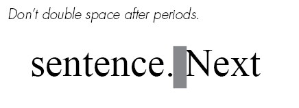
Tip #2: Know how your computer understands graphics.

There it is again, this crazy thing we call a COM-PU-TUR is actually quite stupid. It's only as smart as what some genious programmers or mathematicians have told it to do. What may seem like an easy process for us to grasp, is a huge affair for a computer to understand and that's why you and I pay the big bucks to get these programs like Photoshop or Illustrator to tell it what to do.

When you look at a photograph or image on your computer screen for instance, you see the subjects IN the photo. You see that zit on your face in your prom picture, you see your family gathered around some food, you see naked pictures of Angelina Jolie (yeah right you wish)

Your dumb computer doesn't see it that way.

When your computer looks at a photograph or image it doesn't see your pretty face, your impressive trip photos, or your lost loved ones. It only sees it one of TWO ways, either as dots (pixels) or as lines (vectors).

Let me explain the DOTS this time around and let's save the line stuff for next time or else I'll be here all day. In the most basic sense, every image you're looking at on your screen right now is composed of thousands of adjacent colored dots sitting next to each other to form something that you recognize.

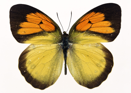
Take a look at this butterfly image for instance:

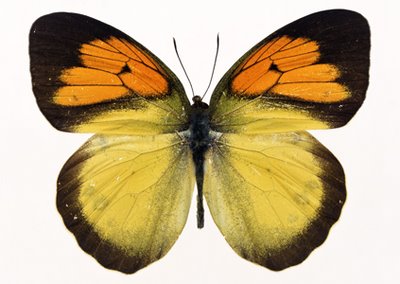
Pretty huh? It's probably dead. But that's ok. For the purpose of this tip, it's a beautiful image of a colorful butterfly. AAAAH. It looks like a reasonably sharp image, nothing that seems out of place.

Now when you zoom up to this photo, you can see how it's made:

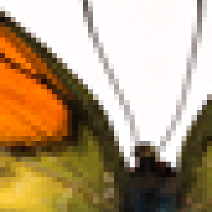
Can you see those little blocks of color? That represents the PIXELS, that sit next to each other to form that butterfly image. For instance, your computer's programming and software tells it that shades of grey blocks have to sit in between the black and white blocks in order for it to look good in the original image.

When you've printed something on a piece of paper it's the same way, except that they would say it's not "pixels" on your screen anymore, but little tiny ink dots on your page. Whatever, the basic idea is the same...

Remember this first concept, the MORE pixels on your page, or the MORE dots on your print, the better. That's because your computer now has more colored blocks to work with to form your images. i.e., It can use MORE shades of grey now. So your images may look smoother or have more detail.

But WAIT! There's more... what about when you reduce or enlarge your images?

Depending on how big your graphic is, there's a limit to how many pixels your screen image can display, or how many little tiny ink droplets your printer can spray on your photo paper. It's probably easiest to explain if I show you this example.

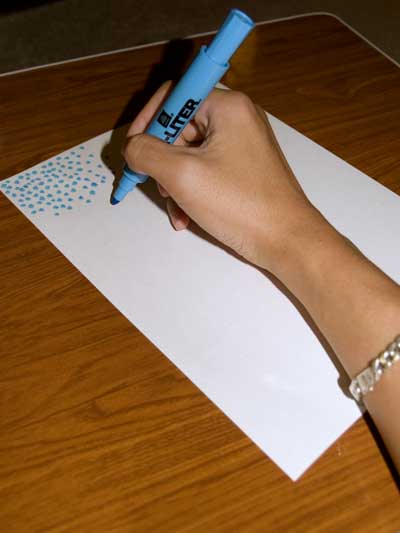
Say you were bored out of your mind one day and you decided to fill a page blue using nothing but tiny blue dots:

Besides the fact you need to find a hobby, you'd be drawing out hundreds, if not thousands of dots, to completely fill out this 8.5" x 11" piece of paper right?

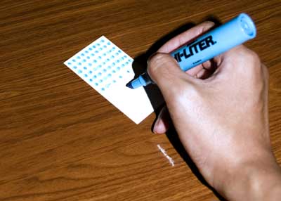
Now say you have a small piece of paper. You need to draw far less dots to completely cover this with blue right? Even if you wanted to draw out just as many dots on this tiny piece of paper as you did in the letter-sized page you'd probably have a hard time doing it, because there's just not enough space to do it. So you just forget about it, draw a few thousand less dots and be done with it.

This is basically what a computer does. When you reduce the size of your image it has to get rid of all the extra pixels or dots. So your computer makes decisions on which colors are best to keep in your photograph to make it look good, and then dumps the rest. More intelligent programs, or more expensive professional cameras help your computer make better choices on what to keep...but most of the time, the average untrained person couldn't tell the difference.

That's why you'll sometimes hear advice when you buy a digital camera for your 4" x 6" family photos, that there shouldn't be a noticeable practical difference between that $150 3megapixel camera, and that $3000 12megapixel camera... because your photo print is going to end up being the same number of dots per inch anyway.

Now when you ENLARGE an image, that's where you run into problems. Now instead of dumping away pixels or dots, it has to create new ones that weren't there to begin with. So it's going to use all these complex calculations to essentially guess at what's the best color to put in between the edges of your lime green logo and its pink background. It's in this circumstance that the computer often has to rely upon the person sitting behind the computer to make the right judgment calls, and even THEN, your graphic designer can only do so much. At some point you'll end up with blurry images, or images that look pixelated just like the zoomed up dead butterfly.

So the 2nd concept to keep in mind is that its easier for you to reduce your graphics rather then enlarge them. Whether you're working on your own projects or you're enlisting the help of a designer, always work with the biggest and best quality image first, and then scale it down to what you need.

Got it? Please don't ask me to take a tiny logo scanned from a business card and scale that up to a wall mural ok? I'll go crazy and start drawing blue dots full time.

Saturday, February 10, 2007

Don't double-space.

I delivered a presentation to my BNI chapter this week. All 10 minutes of it. Actually 10 minutes isn't a whole lot of time. I actually had to rehearse at home quite a number of times to just get my points across within that time frame. In the end, I ended up delivering this presentation seated at a Chinese restaurant round-table because our normal meeting place at Gordon Biersch was booked up because of the Pro-bowl event. It was quite unnerving talking in the middle of a Chinese restaurant so I probably screwed up anyway. BAH, whatever.

I decided I'd give some free basic design tips to my fellow business associates. I figure that will keep them somewhat interested in the topic of design. I think it worked ok.

I might as well give those same tips to you...my silent readership. These are just basic 101 tips, so don't expect miracles.

Tip #1:
I think I was among the last generation to learn typing behind an actual typewriter. My younger brother may have grown up never having even touched one of those contraptions at all can you believe it? In typing class, they always used to tell us to double-space after each period.

However, today it's considered bad form in Typography to double-space.

To this DAY, I still double-space myself. It's a super hard habit to break. I type really fast so it's all just muscle-memory when I type. So now every time, I have to go back across my documents and do a search-&-replace to get rid of all the double spacing. It's annoying.

The reason behind this is that in the days of the typewriter, each stroke of a letter is spaced equally between each other, what they call "monospaced". So having a larger space between sentences helped to give the reader a visual signal when a new sentence would start.

Today, with this newfangled gadget called a COM-PU-TUR, fonts are already designed to somewhat accomidate these reading signals. When you hit that spacebar, the computer is already told to adjust it with a reasonable amount of space to keep the flow of the text comfortable to everyone. Too much space would just start leaving holes in your text.

OK, so now you're all gifted with the knowledge of the single-spacing...go forth and prosper.

Wednesday, February 07, 2007

Wounderful world

Here's a story for you....

Boy falls in love with girl.

Boy decides before last Summer to buy his first diamond ring for girl. Boy searches long and hard, brings multiple girl "sisters" and mom to ring stores to get opinions and finally buys an engagement ring & pretty matching wedding band at local reputable national ring store at a big local mall. Boy thinks he is happy with his choice because the ring is elegant, yet has a little touch of design that makes it unique.

Boy puts a some money down on layaway for a while. Ring store holds ring in the "back" for boy. Boy finally goes in about a week later to pick up this ring. Boy's mom is there to help out.

Boy is given the ring, but is told they don't presently have the diamond ring's matching certificates to verify the diamond's quality. Ring store tells the boy that the diamond has a lasered number on the diamond so it's no problem...the certificate will be mailed to the boy within 10 business days. Boy figures the ring store is reputable...so he takes rings home.

A few days later, Boy calls the Ring Store to find out they are having trouble finding the certificate. Boy takes ring back and the Store manager takes down the diamond number and says he'll find it. "The certificate will be mailed within 10 business days" says the manager.

Within a few days, the Boy flys a loooooooooong way to see the Girl that he's fallen in love with and spends the next few days trying to find a good way to hide the Ring and make a big surprise. Boy ends up having the hardest time planning anything right in the Girl's strange land, so he somehow stumbles around and proposes to Girl. Girl accepts the ring. Boy and Girl skip happily around like crazy people. Girl's parents intimidate the Boy. Storyteller digresses.

Boy comes back home.

Boy still hasn't received certificate from the Ring Store. Now the Ring Store elves tells the Boy that the manager lost the number he originally recorded. Boy tells Ring Store the diamond is now half way across the world in a strange foreign land. Boy demands Ring Store find it and write a complaint letter to the Store's King and...err.... Vice King? The Ring starts losing some of its magical powers as the Boy starts to feel like something is wrong.

The Vice King writes back apologetically, hustles and finds a certificate for the Boy. He assures the Boy that THIS certificate is almost certainly the right one, but the only way to be sure is to match up the numbers one day when the Girl comes back with the magic ring. Boy is reasonably satisfied.

A few months later, the Girl comes to visit the Boy with her magic ring. The Boy says, "Hey, no fair, I want a magic ring too!" So the Boy and Girl decide to visit the Ring Store once again together. Boy thinks, "Hey, we might as well have them match the Ring with the Certificate once and for all! THEN we can get ME a magic ring of my own and then ALLLLLL will be good in the world"

Ring Store elf looks at the Ring's shiney diamond and ends up with a number that looks nothing like the number on the certificate. "GAASP!" says the Boy and the Girl. "How can this happen?" says the Boy. The elf apologizes, takes the new number down, and says they'll find the right certificate that will restore the Ring's magic powers. All within "10 business days"

Boy and Girl are patient. They let the Ring Store elf engrave the wedding band with a magic chant once delivered by the magic fairy, Elton John. "How Wonderful Life is..." Ring Store elf starts crying when she hears of this magic fairy chant. Apparently other elves have heard of this magic fairy before...he's supposed to be powerful at golden fleece basket weaving or something.

Boy and Girl are told that the wedding band is ready two days later. "OH, that's wonderful!" says the Boy and Girl. They rush down to the Ring Store to pick up the ring and take it home where it will forever shine in its magical brilliance.

Upon taking it home, Boy and Girl are dashed to discover the wedding band isn't properly engraved with the magic fairy chant after all, but instead it says, "How Wounderful Life is..."

Turns out the Ring Store elf apparently couldn't spell, OR she had problems seeing through her magical tears.

Boy has now turned into a big green ogre and is very upset at the Ring Store and all its stupid elves.

THE END?

Monday, February 05, 2007

Loose pants

This is the second time in a matter of months that I have to completely reveal all my banking & financial account statements to a bunch of strangers.

The first time was a few months ago when out of a whim I went to qualify for that condo suite. I had to get records going back as far as 3 years. I told my mortgage broker "boy, I feel so naked revealing all this stuff about me like this". His response was, "Get used to it"

I guess he was right. Now my fiancee is going through the final stages of her visa process and now I have to present this affidavit of support showing that she won't become a public charge. Basically they don't want an alien resident coming in just to sit in welfare.

Fair enough. But once again, I gotta collect all this information from my financial institutions basically revealing all my finances to anybody who wants to see it. No, it's not like I'm running drug money or anything through my accounts, but I still get the sensation it's like someone's asking me to drop my pants, bend over, drop my nutsack, and cough. (too much listening to Ice Cube music I think).

Well, gotta do what I gotta do. Time to go visit my banks. I better wear loose pants.

Friday, February 02, 2007

What hands can do


Here's a little bit of creative inspiration packaged in the form of a VW ad.

Blaaaaah

This whole week I've been sort of "Blaaaaah". It's not anywhere close to slash-my-wrist depression, but it's just one of those weeks where it's hard to get out of bed and keep going. This morning at the gym I had to move between equipment like a slug. Someone even came up to me while I was sitting at one of the workout machines between reps and asked me "Are you using that?"

Uhhh....no I'm just sitting here staring at the weights lifting it mentally with my mind what does it look like? I guess I was moving too slow for him.

Yeah so there's this funk I'm in and there's no solid reason why...but I won't bore you, my silent visitors with all that stuff. I don't want to turn this blog into a giant Richard Lewis sketch.

I've prescribed myself some motivational medication... going to eat healthy food the next few weeks, get more exercise, and dose myself with all the feel-good music I can find. A little bit of Jack Johnson, G. Love, Ben Harper and Bob Marley should do the trick. After all of this, if I don't become a big fuzzy ball of positive energy, you can come hit me.

Thursday, February 01, 2007

Give me a break

Coming home from a meeting today I saw a HUGE yellow HUMMER vehicle with a giant sticker on the windshield that read "GOD FIRST"

How's that for irony? Yeah, "god first" but I'll drive around in my giant fuck-the-world, look-at-me vehicle. Mmmm hmmm.

I've asked 2 printers already if they offered any recycled or enviroment-friendly paper options and nobody responded.

You know...I'm no saint when it comes to recycling, but when nobody else around you cares, it's hard to even want to try at all. Time for me to go hug a drowning polar bear.

Oh Boo Hoo Raph

These next few months will be some of the most challenging months of my life. I have a wedding to pull off & I still have some work remaining with the immigration office to help my fiancee officially welcomed into the U.S. Her visa is really close to being officially approved but there remains a few tiny hurdles to cross.

Financially, I have tax season coming up where practically 30% of last year's earnings will be gouged away from me. I've heard that a self-employed single person has the hardest time with taxes... I don't doubt it. Luckily I've sheltered away 30% of my earnings last year precisely to pay off taxes this year...but somehow a part of me was hoping I'd hear that Uncle Sam would be good to me and tell me that money was mine to keep free and clear (that would have made great wedding fund money). As it stands, I'll probably be paying an extra few thousand dollars in FICA taxes and maybe another grand or two for my accountant. AUWE! I can't win.

Yeah, that's a very "cup half empty" way of looking at it. I know I can only have tax money taken away from me only if I made money in the first place. But it's hard looking at a huge check I may have to write and feel that it's a compliment. I'll try, but the Chinese in me can't help but feel like I'm being ripped off.

I know people have a million ways to shelter their money in 401Ks and SEP plans and such. I need to be more attentive to that. That's such a pain though...it's hard enough earning the money in the first place much less worry about what's the best way to keep it.

Guess I'll just keep my ears open & hope for a random act of kindness from a rich philanderer who can just give me a million bucks. Imagine how much taxes I'll have THEN. Bastards.